


—
It was back in the early 1600’s, when the Dutch started shipping the Asian tea leafs to Europe. As the famous saying goes; countries where tea was imported by sea use variations of ‘tea’. Tea, thee, the, thé, té, tee, te, teh, … or simply T.
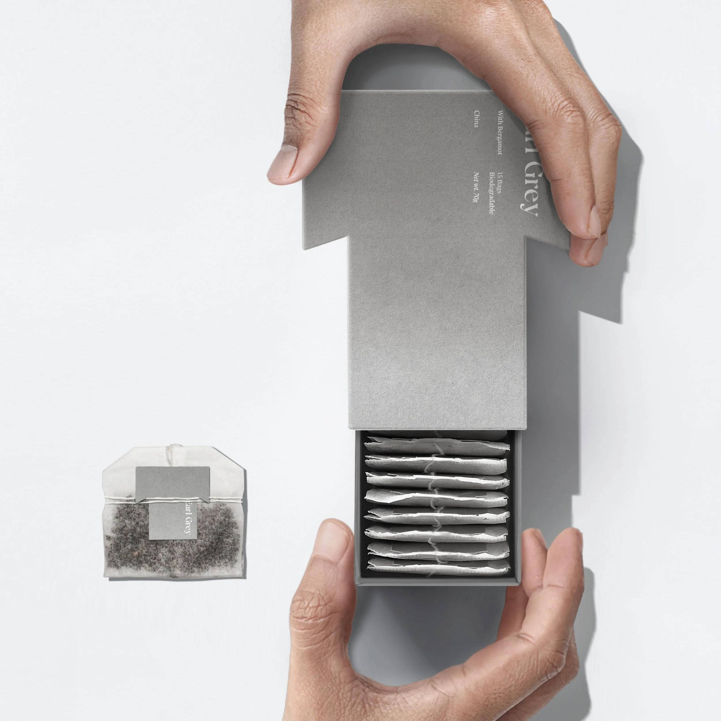
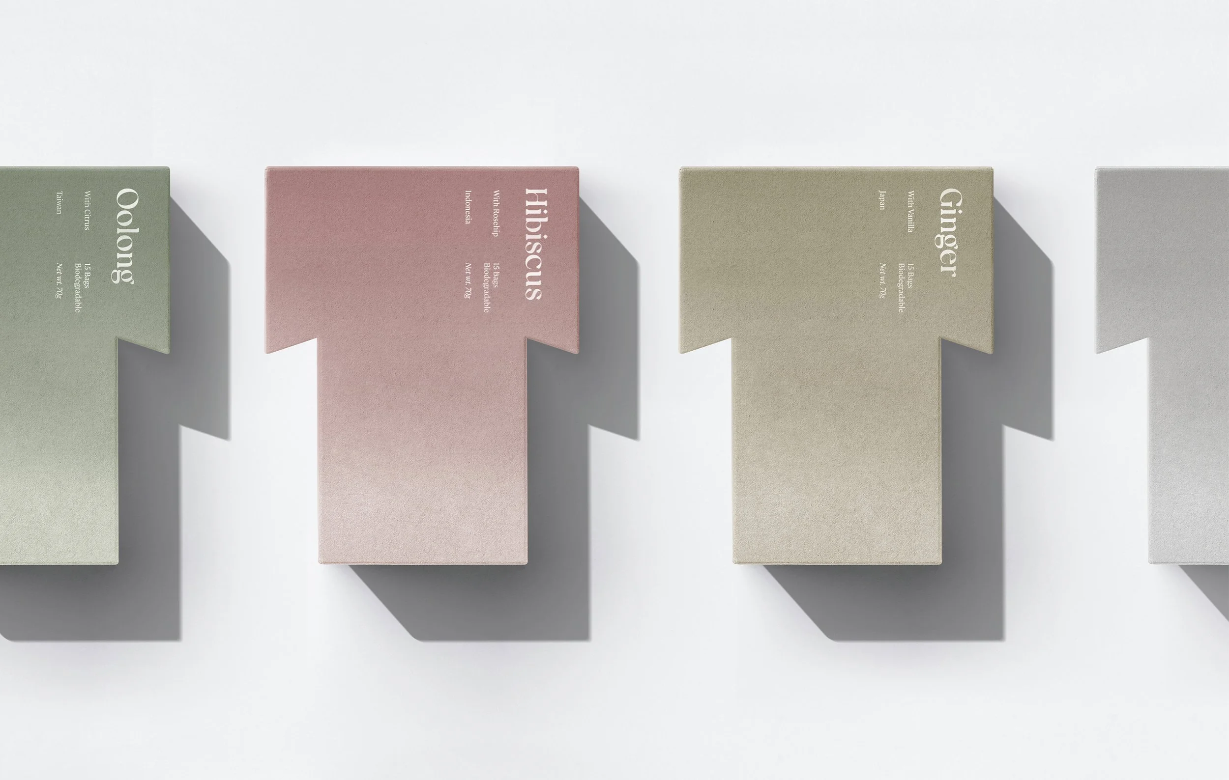
The character ‘T’ not only sounds phonetically as ‘tea’, it can also be understood in more than 20 languages as the hot aromatic beverage. This packaging communicates its content just by the shape of one single character. A unique packaging that is inspired by how it is pronounced in countries on the western market.
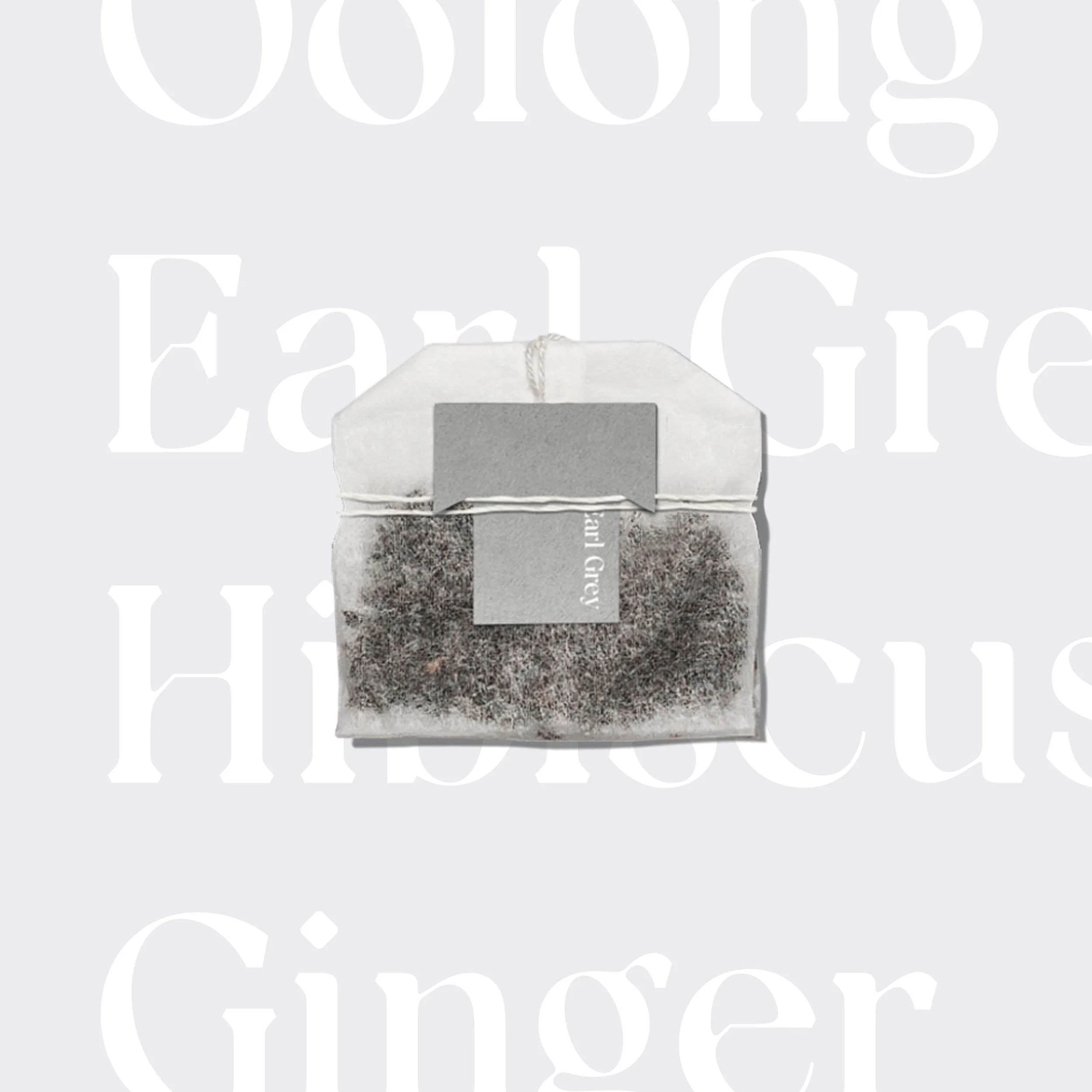
The biodegradable packaging differentiates the tastes of the tea by using colours that are softly fading out towards the bottom. This symbolizes the tea fluidly dissolving in hot water. A typeface that is inspired by nature, features a stem from botanical influences. Shown by tiny broken strokes in the crossbars, giving it a classic yet natural feel. These diagonal details are also characterising the T-shaped box and the functional tea bag string closure.
No imagery or oversaturated colours are needed to catch your attention on the shelf. This packaging stands out just by its recognisable shape.
Pure T.
—
Awards:
Pentawards 2022 — Finalist