


—
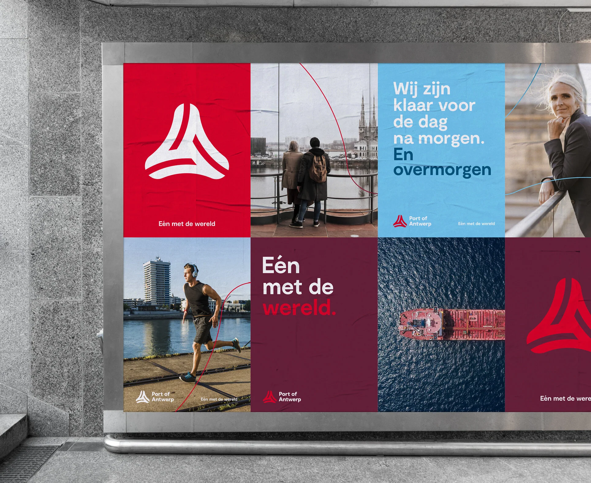
A new direction calls for a brand new story and a brand new visual identity.
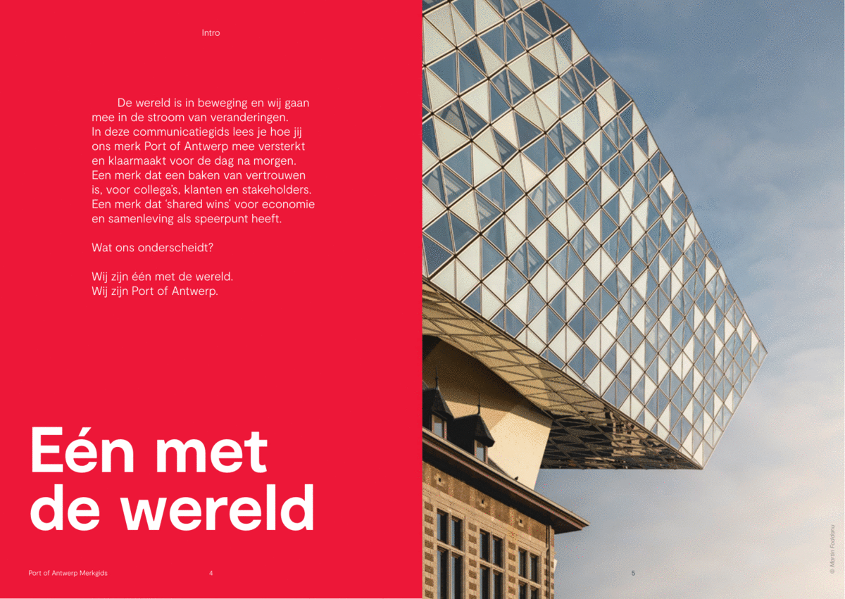
Port of Antwerp wants to be a haven that’s vital for a sustainable future. A home for maritime and logistical services, on a world scale, by connecting employees, clients, stakeholders and society at large to tackle tomorrow’s challenges together.
Its new visual identity embodies this story as a symbol of the future Port of Antwerp. No revolution, but evolution. Acknowledging a trusted brand, yet revitalizing it by making its shape rounder to symbolize collaboration, accessibility and dynamism, by rejuvenating the red for a fresher and more powerful feel, and by reinventing its entire surrounding look & feel, tone-of-voice and imagery.
Port of Antwerp. In tune with the world.
Made for BBDO Belgium ©