


—
Branding electricity
Jetech is an Antwerp based company, delivering electricity solutions and connections of businesses to the net.
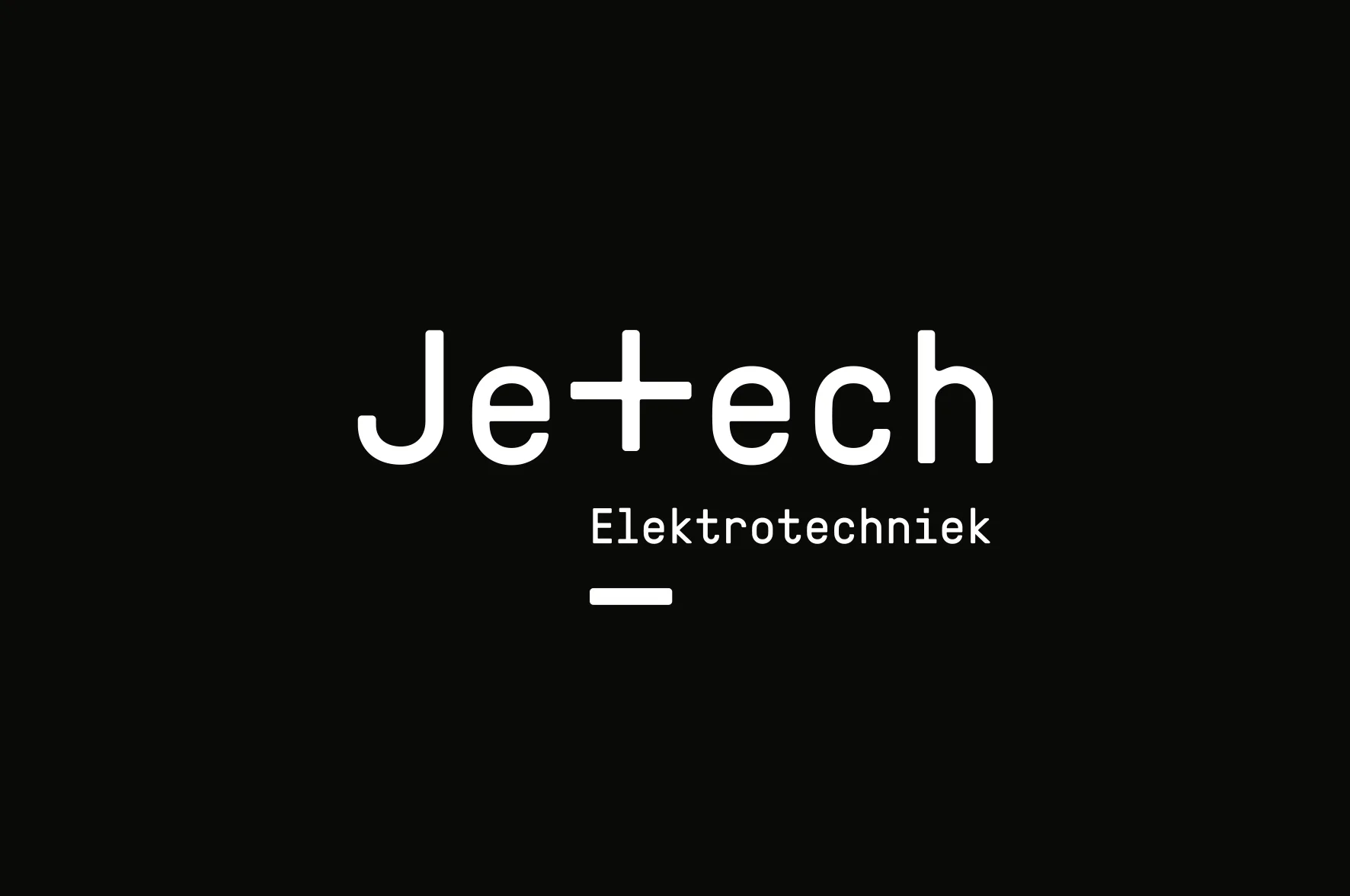
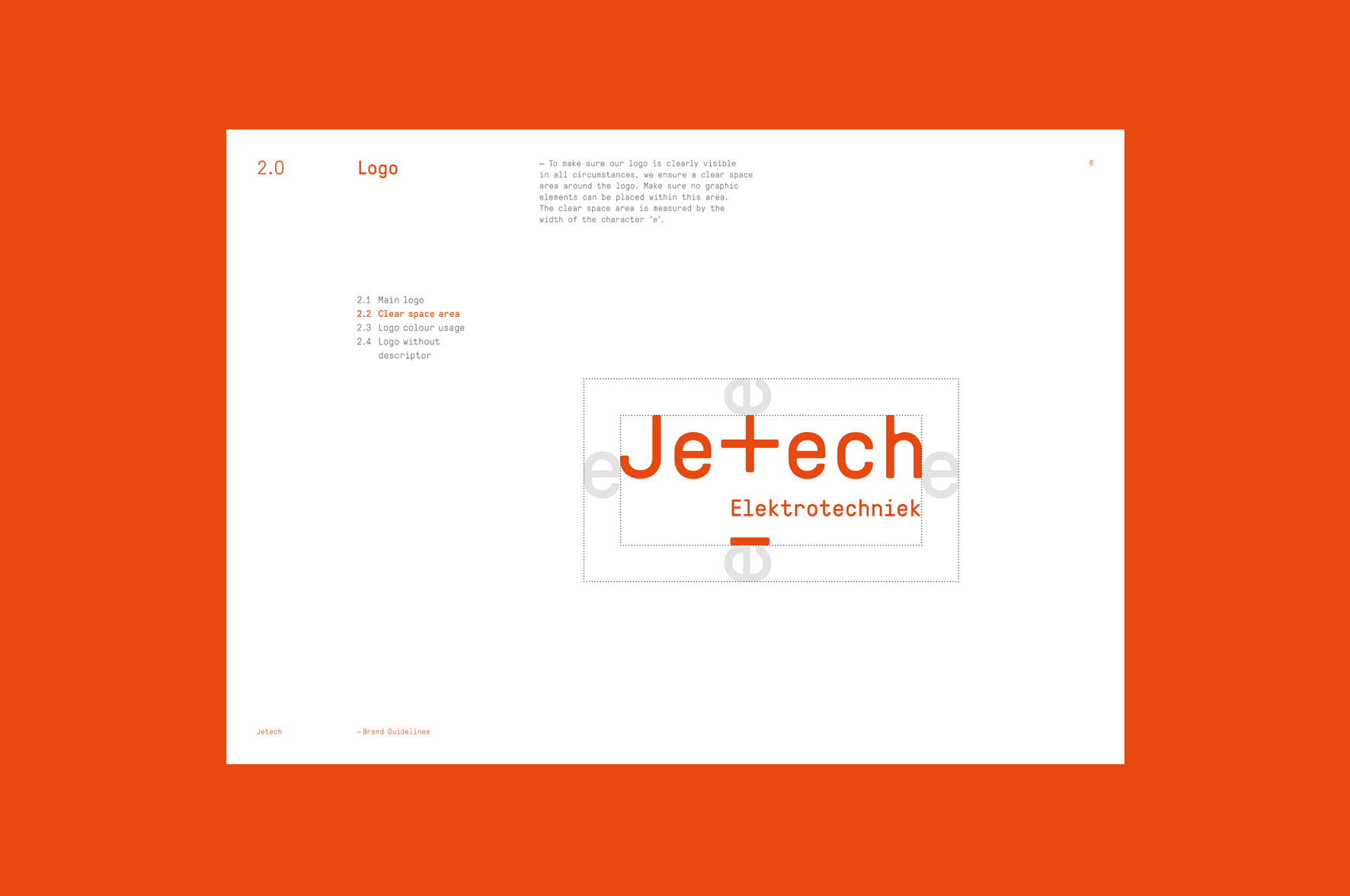
The new identity finds its inspiration in electrical polarity, the connection between ‘plus’ and ‘minus’. It represents the electrical potential at the ends of a circuit.
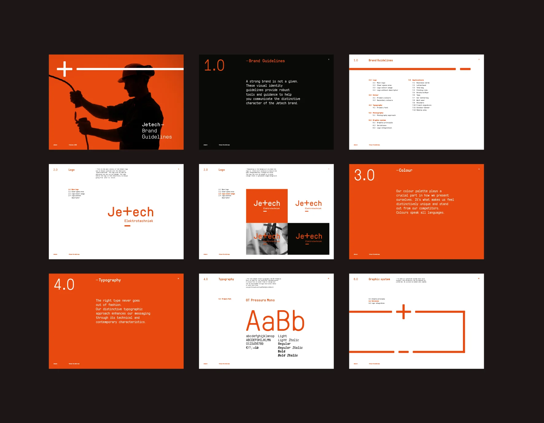
This idea resulted in a flexible graphical system that easily adapts itself to each carrier or communication tool.
The vibrant orange was chosen to convey a sense of energy and make the identity stand out among the traditional electricians. The monospaced font is inspired by the technical character of electricity plans. The basis where it all starts with.