


—
Stepping away from the intention of what a logo is or should be, it had to reflect my way of working and personal approach.
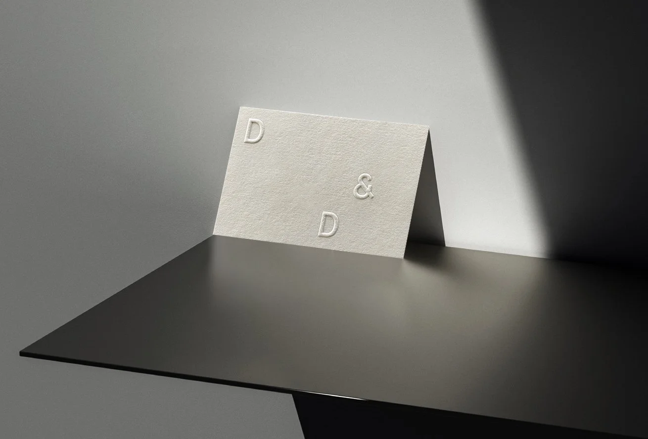
The identity revolves around a typographic system that communicates with the essential characters. A modular wordmark combines my doubled initials together with a functional ampersand that emphasizes the connection with my clients and their projects. A visual system that can be tailored depending on the application and its function.
The result is an identity that merges minimalism with tactility through a range of uncoated paper stocks finished with blind embossing and black foil blocking.